
Social Links Redesign @ Diablo Tools
UX Design Intern | May-July 2026 | Figma, HotJar, HubSpot
During my UX Design internship at Diablo Tools, I designed landing pages, mobile app screens, and conducted user research. If you’re interested in learning more about work beyond this project, please contact me at Amaya.Powell@uga.edu or view my resume for more details.
Overview
Designing a Clearer Path to Product
For this project, I collaborated with the Social Media team to redesign their Link-in-Bio page and create an intuitive way for users to discover products.
The redesign focused on creating a clearer visual hierarchy, simplified product discovery, and a refreshed interface that better reflected Diablo Tools’ brand identity. The result was a more cohesive experience that connected social media content with relevant products.
The Previous Experience
A cluttered interface made it difficult for users to engage with project.
The Redesigned Experience
01 - Clearer hierarchy
Reorganized content to improve visibility and scanning.
02 — Enhanced engagement
Introduced a more visually compelling, brand-aligned layout.
03 — Intuitive Navigation
Simplified access to Diablo Tool's social platforms
Problem
Navigating from Post to Product, Users Got Lost.
The Link-in-Bio page serves as a key touchpoint between Diablo Tools’ social media content and its products. However, cluttered layouts, weak visual hierarchy, and an excessive use of accent colors made navigation difficult. The goal was to create a cleaner, more intuitive experience that guided users toward key content.
01 - Weak hierarchy, 02 - Inconsistent spacing, 03 - Overuse of Accent Red

Research
Identifying Friction and Opportunities
Understanding User Behavior
I explored Hotjar heatmaps and engagement data to understand how users interacted with the existing page. Low click-through rates suggested that page wasn’t effectively directing users toward important content, reinforcing the need for clearer navigation and visual hierarchy.
Learning from Competitors
I analyzed five brands’ social-link pages, including Milwaukee, Dewalt, and Home Depot, to identify common design patterns. I found that the recurring three-column layout offered a familiar, scannable way to organize content. This insight helped inform my initial wireframes, allowing me create a structure that felt intuitive while still being tailored to the Diablo Tools brand.

Collaboration
Turning Team Goals into Design Decisions
I led ideation meetings with the Social Media team to better understand the page’s purpose and desired user actions. The team’s key requests were incorporated in my initial designs: highlight the top four marketing-priority products, create dedicated pages with product-specific banners, and continue using Diablo’s accent red as a primary color.
I recognized that this approach could contribute to visual clutter and make product discovery more difficult. Adding an additional step to the user journey provided little additional value, and the proposed layout and color could visually overwhelm the user.
Advocating for an Improved User Experience
I presented an alternative design recommendation to the team, advocating for an improved user experience through an improved visual hierarchy. After communicating my design rationale, the team approved my recommendation and I translated these goals into wireframes that simplified the user journey and prioritized product discovery.
Initial Direction

Final Direction (My Reccomendations)

Ideation
Every Iteration Has a Purpose
Designing in Figma
I created 13 wireframes and design variations in Figma, each exploring a specific aspect of the user experience:

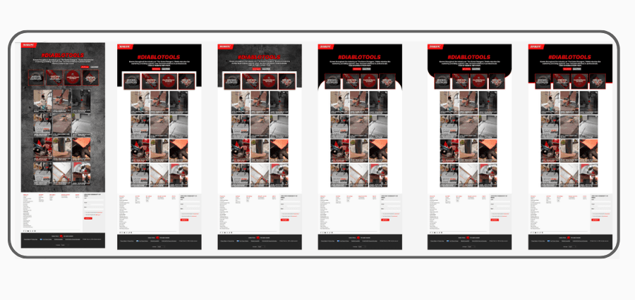

Moving the Designs to the Site
I then developed the designs in HubSpot to evaluate how they translated into functional web pages. Through iterative feedback and design review sessions with the Social Media team, we narrowed the concepts to four finalists before selecting a direction that balanced user needs with business goals.

The Solution
Making Product Discovery Effortless
Clearer Visual Hierarchy
A three-column layout organizes content into easily scannable sections, reducing visual clutter. A more intentional use of red creates emphasis without overwhelming the page.
More Intuitive Interactions
Hover states help users identify featured products and understand where to click.
A Direct Path to Products
Direct product links make it easier for users to move from social media content to product pages.
Reflection
Good Design Is Intentional and Collaborative
Designing with Purpose
This project reinforced the importance of designing with intention. Exploring multiple directions challenged me to think beyond aesthetics and consider how each decision, from visual hierarchy to image placement, could shape the user experience.
I learned to approach design decisions with a stronger sense of purpose, balancing visual appeal, usability, and business goals to create an experience that was both engaging and functional.
Collaboration and Next Steps
This project also taught me how valuable cross-functional collaboration can be in shaping a design. Working closely with the Social Media team allowed me to incorporate feedback in real time while balancing user needs with business goals.
This project was handed off to a team of developers. With the redesign preparing for launch, I’d love to revisit Hotjar data to evaluate engagement and identify opportunities for further improvement.


